In my last post, I went through the basics of creating a ggplot2 object. Here, I’ll be focusing on how to alter the standard look of ggplot2 and make other changes to make the visualisation right for you.
We’ll start by loading the same dataset of hawk measurements we used last time, and creating a plot we can adapt throughout.
library(ggplot2)
library(data.table)

hawks <- fread('https://vincentarelbundock.github.io/Rdatasets/csv/Stat2Data/Hawks.csv',
               select = c('Species', 'Age', 'Sex', 'Wing',
                          'Weight', 'Tail', 'Year'))

# Remove some rows with missing weight or wing data
hawks <- hawks[!is.na(Weight) & !is.na(Wing)]

# Label unknown values for sex and age
hawks[Sex == "", Sex := "Unknown"]
hawks[Age == "", Age := "Unknown"]

# Label hawk species
hawks[Species == "RT", Species := "Red-tailed"]
hawks[Species == "SS", Species := "Sharp-shinned"]
hawks[Species == "CH", Species := "Cooper's"]

# ggplot2 bar chart
ggplot(data = hawks, mapping = aes(x = Species, fill = Age)) +
  geom_bar()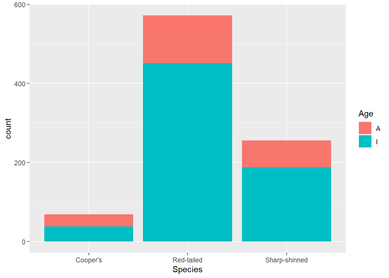
Text
Starting with the labs() function, we can change a lot of the text. I like to use this function because you can use it to change the title, subtitle, caption or tags as well as the axes labels or other aesthetics. Here’s an example with all of those things added.
ggplot(data = hawks, mapping = aes(x = Species, fill = Age)) +
  geom_bar() +
  labs(y = "Count",
       fill = "Adult/Immature",
       title = "Number of hawks by species",
       subtitle = "Red-tailed hawks were counted most often",
       caption = "Data collected 1992-2003",
       tag = "Figure 1")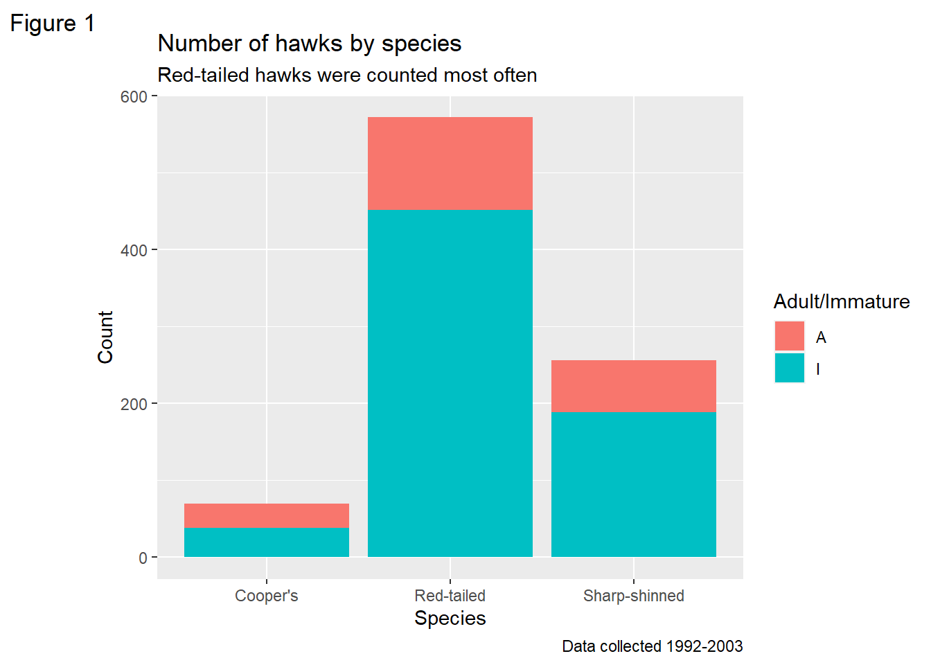
There are other functions you can use that are more specialist, like xlab() and ylab() for the axes and ggtitle() for the title, but obviously those only cover those specific labels.
However, there’s still text on there that we haven’t changed. These are to do with the legend category labels and the labels on the axes ticks. There are a group of functions that cover these that all start with scale_*(). The first part is scale, the second part is the aesthetic you are changing and the third part is whether it is discrete, continuous or manual (i.e. specified by you). So here, we can change the labels on the legend with scale_fill_discrete(), because it relates to the fill aesthetic and it’s a categorical variable. The labels argument changes the labels.
For illustrative purposes, I’ve also used scale_y_continuous to change where the tick marks land (every 150 hawks) and spell out the labels.
ggplot(data = hawks, mapping = aes(x = Species, fill = Age)) +
  geom_bar() +
  labs(y = "Count", title = "Number of hawks by species") +
  scale_fill_discrete(labels = c("Adult", "Infant")) +
  scale_y_continuous(breaks = c(0, 150, 300, 450, 600),
                     labels = c("No hawks", "150 hawks", "300 hawks",
                                "450 hawks", "600 hawks"))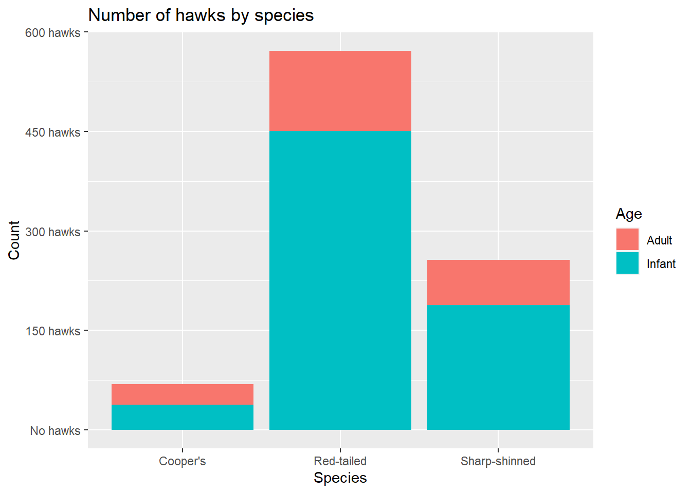
Reordering
This would be easier to interpret if the species were ordered by count (which would be more true if you had lots of species to compare).
This is a quick and easy way using the forcats package, which doesn’t change your original data. The alternative is to transform your original data so your variable is a factor ordered by count, which is a bit cumbersome if the only reason you are doing it is for one plot. The change comes in defining the x argument in aes().
Note that we also have to add in a label for the x axis; otherwise we would get the unsightly forcats::fct_infreq(Species) as the label. Bear in mind that if you have the forcats packaged loaded, you don’t need to specific the package in the function call, which makes it look a little less busy.
I’m also going to assign this to an object now so I can work on it without having to write the same lines repetitively.
hawks_by_species <- ggplot(data = hawks,
                           mapping = aes(x = forcats::fct_infreq(Species),
                                         fill = Age)) +
                        geom_bar() +
                        labs(x = "Species", y = "Count",
                             title = "Number of hawks by species") +
                        scale_fill_discrete(labels = c("Adult", "Infant"))

hawks_by_species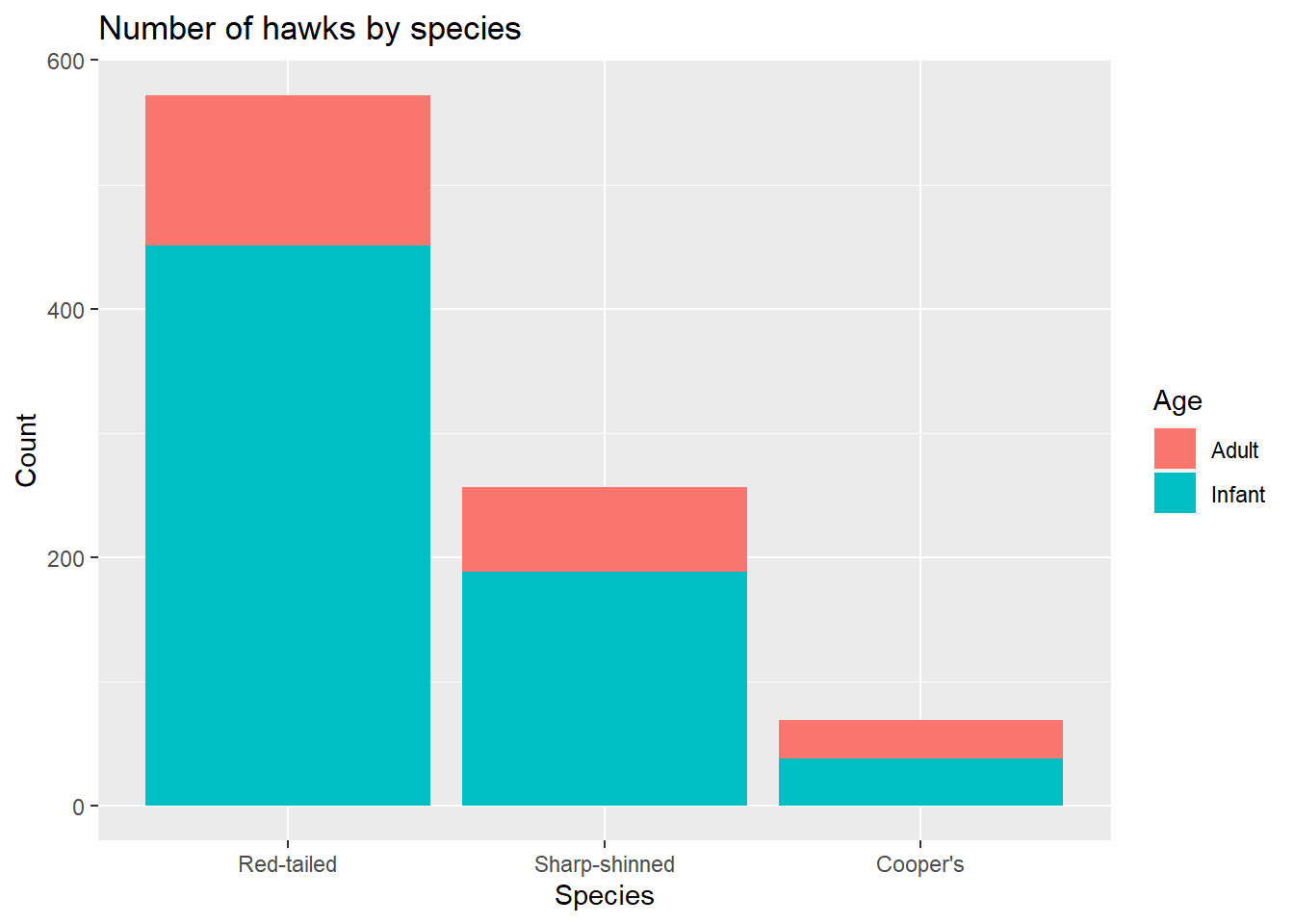
Change the theme
There are several themes built into ggplot2, so you can easily use one of those to quickly achieve a look you are happy with. These impact the colour of the plot, thickness and existence of gridlines, font details, legend position and more. Below are a few examples.
hawks_by_species +
  theme_bw()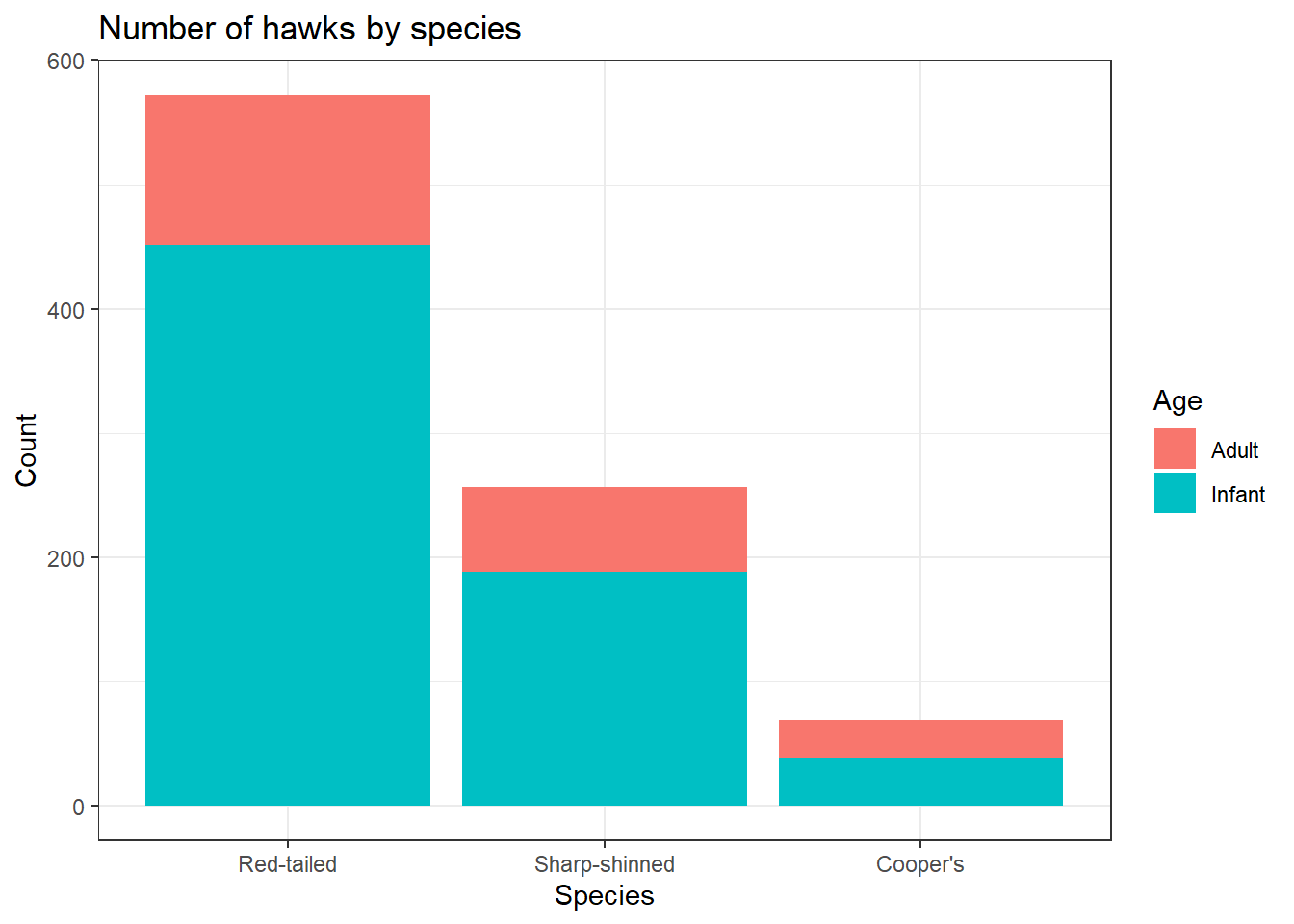
hawks_by_species +
  theme_classic()
hawks_by_species +
  theme_minimal()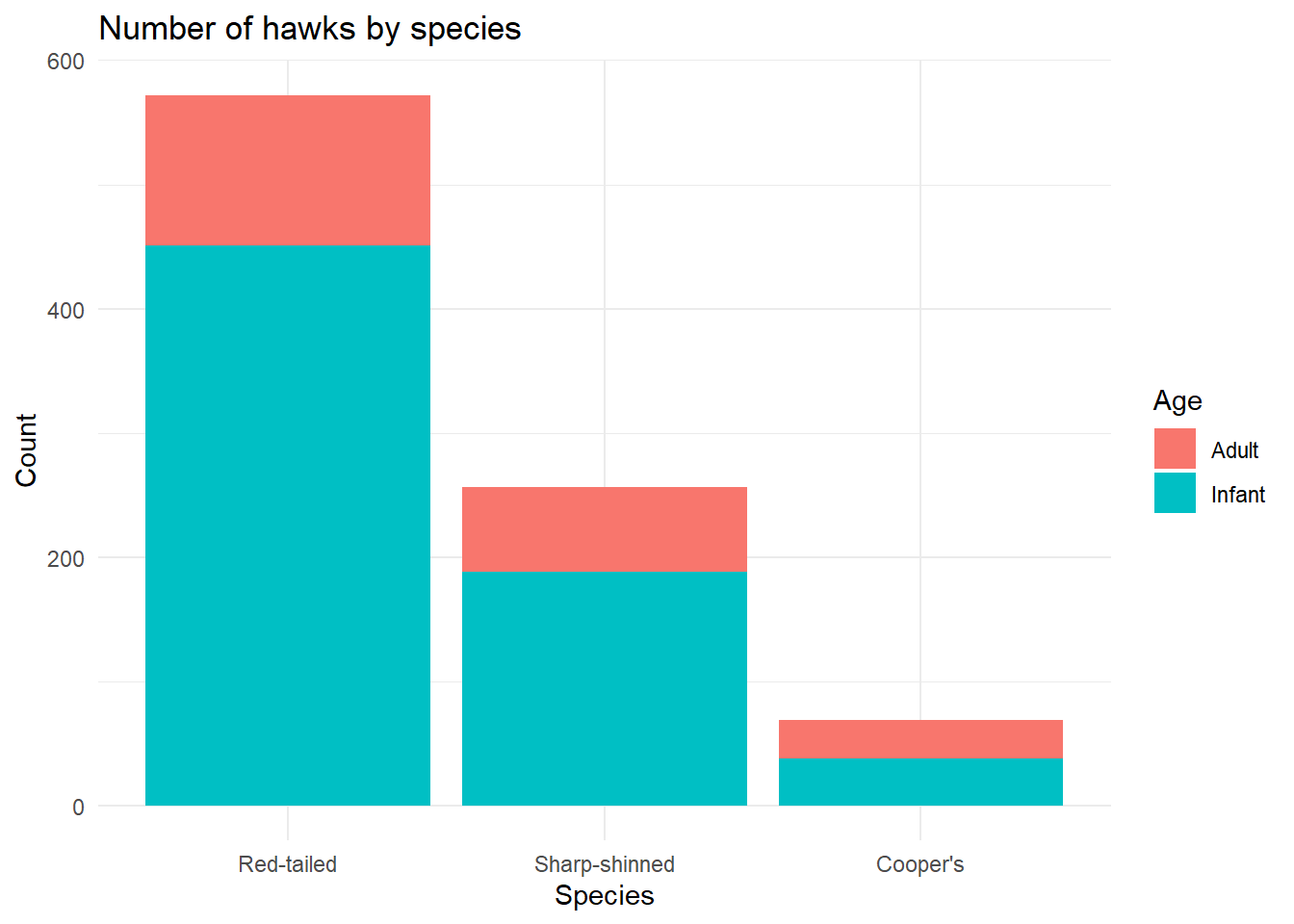
The things changed within these built in themes can be accessed through the theme() function. This has a LOT of arguments that you can change; here is the list from the documentation.
theme(
  line,
  rect,
  text,
  title,
  aspect.ratio,
  axis.title,
  axis.title.x,
  axis.title.x.top,
  axis.title.x.bottom,
  axis.title.y,
  axis.title.y.left,
  axis.title.y.right,
  axis.text,
  axis.text.x,
  axis.text.x.top,
  axis.text.x.bottom,
  axis.text.y,
  axis.text.y.left,
  axis.text.y.right,
  axis.ticks,
  axis.ticks.x,
  axis.ticks.x.top,
  axis.ticks.x.bottom,
  axis.ticks.y,
  axis.ticks.y.left,
  axis.ticks.y.right,
  axis.ticks.length,
  axis.ticks.length.x,
  axis.ticks.length.x.top,
  axis.ticks.length.x.bottom,
  axis.ticks.length.y,
  axis.ticks.length.y.left,
  axis.ticks.length.y.right,
  axis.line,
  axis.line.x,
  axis.line.x.top,
  axis.line.x.bottom,
  axis.line.y,
  axis.line.y.left,
  axis.line.y.right,
  legend.background,
  legend.margin,
  legend.spacing,
  legend.spacing.x,
  legend.spacing.y,
  legend.key,
  legend.key.size,
  legend.key.height,
  legend.key.width,
  legend.text,
  legend.text.align,
  legend.title,
  legend.title.align,
  legend.position,
  legend.direction,
  legend.justification,
  legend.box,
  legend.box.just,
  legend.box.margin,
  legend.box.background,
  legend.box.spacing,
  panel.background,
  panel.border,
  panel.spacing,
  panel.spacing.x,
  panel.spacing.y,
  panel.grid,
  panel.grid.major,
  panel.grid.minor,
  panel.grid.major.x,
  panel.grid.major.y,
  panel.grid.minor.x,
  panel.grid.minor.y,
  panel.ontop,
  plot.background,
  plot.title,
  plot.title.position,
  plot.subtitle,
  plot.caption,
  plot.caption.position,
  plot.tag,
  plot.tag.position,
  plot.margin,
  strip.background,
  strip.background.x,
  strip.background.y,
  strip.placement,
  strip.text,
  strip.text.x,
  strip.text.y,
  strip.switch.pad.grid,
  strip.switch.pad.wrap,
  ...,
  complete = FALSE,
  validate = TRUE
)
You can probably get a sense for what many of those might do, and as you can see there are often several versions so you can either apply a change to everything of that type or specific elements. For example, if you use text, you can change every text element; if you use title, you would change only the title text elements (plot/axes/legend titles); if you used axis.title, that would only change the axes titles, whereas axis.title.x would only change the x axis title, and so on!
For most arguments in theme(), you specify what kind of element you are changing (element_line(), element_rect(), element_text(), or element_blank() to remove something). This then limits the arguments to relevant ones for the object. I think this can take a bit of getting used to because there are so many options, but if you know what you want to do then the path normally becomes evident.
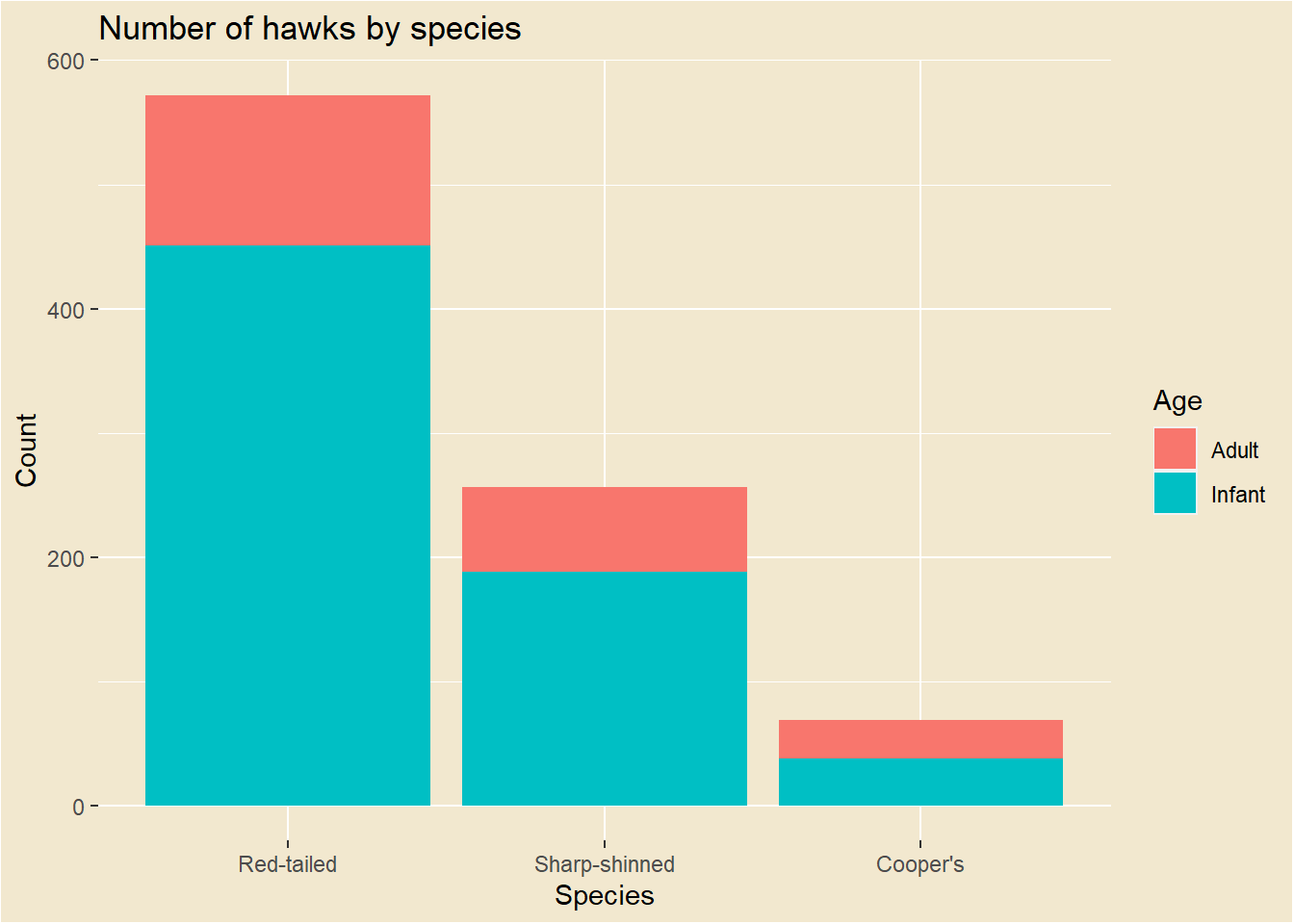
So if I want to change the background colour of my plot, I need to consider the plot, panel and legend, like this:
hawks_by_species +
  theme(
    plot.background = element_rect(fill = "#F2E8CF"),
    legend.background = element_rect(fill = "#F2E8CF"),
    panel.background = element_rect(fill = "#F2E8CF")
    )
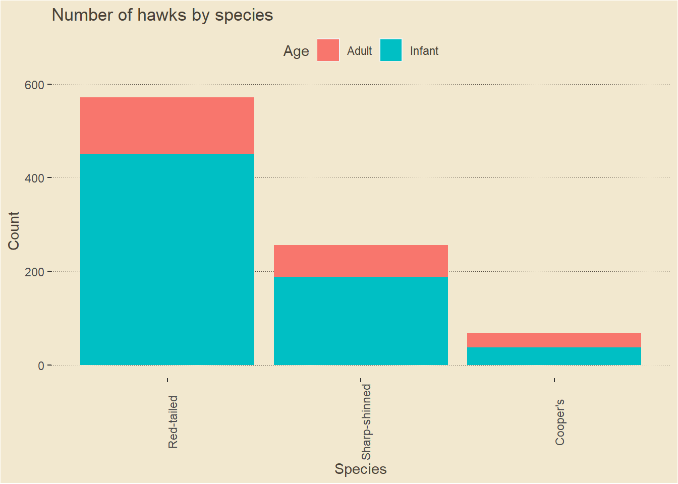
Those all use element_rect() because they are about areas, whereas changing the font colour uses element_text() and changing the gridlines uses element_line(), which I can also use to change the line style. Let’s also move the legend and put the x axis text at an angle, just to show how much you can do in theme(), although I won’t include those changes in future steps.
I also use element_blank() to get rid of excessive gridlines.
hawks_by_species +
  theme(
  plot.background = element_rect(fill = "#F2E8CF"),
  legend.background = element_rect(fill = "#F2E8CF"),
  panel.background = element_rect(fill = "#F2E8CF"),
  text = element_text(colour = "#4A4238"),
  panel.grid.major.y = element_line(colour = "#4A4238",
                                  size = 0.2,
                                  linetype = "dotted"),
  panel.grid.major.x = element_blank(),
  panel.grid.minor = element_blank(),
  legend.position = "top",
  axis.text.x = element_text(angle = 90)
    )
I also might want to change the font. To get new fonts, you can take a few extra steps by using the showtext package. Choose a font from Google fonts, then make sure you can use it like this:
library(showtext)

# Add google font required
font_add_google(name = "Roboto", family = "Roboto")

# Check it is in your font families
font_families()

# If not, look here for the file
font_files()

# And add it manually
font_add("font_you_want", "font_you_want.ttf")
However, to keep it simple here I’ll use one of the fonts I already have, which I can reference in the family argument. I need to load the fonts with the extrafont package. You can also see here that I’ve set the font to Bahnschrift in the highest level of text, but in plot.title I’ve overriden this with Agency FB - the more specific argument will override the more general one.
extrafont::loadfonts(device="win")

hawks_by_species +
  theme(
  plot.background = element_rect(fill = "#F2E8CF"),
  legend.background = element_rect(fill = "#F2E8CF"),
  panel.background = element_rect(fill = "#F2E8CF"),
  text = element_text(colour = "#4A4238", family = "Bahnschrift"),
  title = element_text(face = "bold"),
  plot.title = element_text(family = "Agency FB", size = 20),
  panel.grid.major.y = element_line(colour = "#4A4238",
                                  size = 0.2,
                                  linetype = "dotted"),
  panel.grid.major.x = element_blank(),
  panel.grid.minor = element_blank()
    )
Rather than adding this chunk of code to every plot, I can assign it to an object that I can then add to any other plot.
hawk_theme <-   theme(
  plot.background = element_rect(fill = "#F2E8CF"),
  legend.background = element_rect(fill = "#F2E8CF"),
  panel.background = element_rect(fill = "#F2E8CF"),
  text = element_text(colour = "#4A4238", family = "Bahnschrift"),
  title = element_text(face = "bold"),
  plot.title = element_text(family = "Agency FB", size = 20),
  panel.grid.major.y = element_line(colour = "#4A4238",
                                  size = 0.2,
                                  linetype = "dotted"),
  panel.grid.major.x = element_blank(),
  panel.grid.minor = element_blank()
    )

hawks_by_species +
  hawk_theme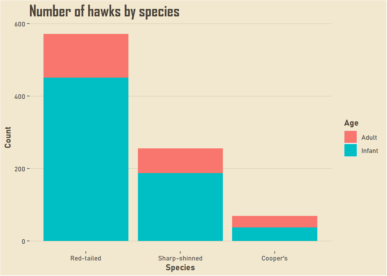
You will have noticed that I haven’t been able to change the colour of the bars in theme(). We can change those in scale_fill_manual(). We can either specifiy our own colour palette, or use existing colour palettes in R.
hawk_colours <- c("#386641", "#A7C957")

hawks_by_species +
  scale_fill_manual(values = hawk_colours) +
  hawk_theme
## Scale for 'fill' is already present. Adding another scale for 'fill', which
## will replace the existing scale.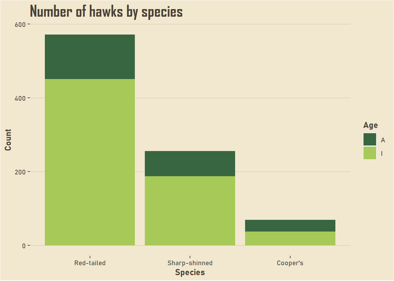
Have a look at the error message; we already have a scale_fill_*() function in our ggplot object so this has overwritten that one, which means we have the legend reverting to its original state. I don’t want to add the labels into this new layer because I want it to be applicable to other graphs, so we’ll have to tweak the labels in the data itself. Because the next step is to include this colour palette into the theme object!
As this StackOverflow answer demonstrates, you can bundle this layer into a list with what you already have.
hawk_theme_2 <- list(hawk_theme, scale_fill_manual(values = hawk_colours))

hawks[Age == "A", Age := "Adult"]
hawks[Age == "I", Age := "Infant"]

ggplot(data = hawks, mapping = aes(x = forcats::fct_infreq(Species), fill = Age)) +
  geom_bar() +
  labs(x = "Species", y = "Count", title = "Number of hawks by species") +
  hawk_theme_2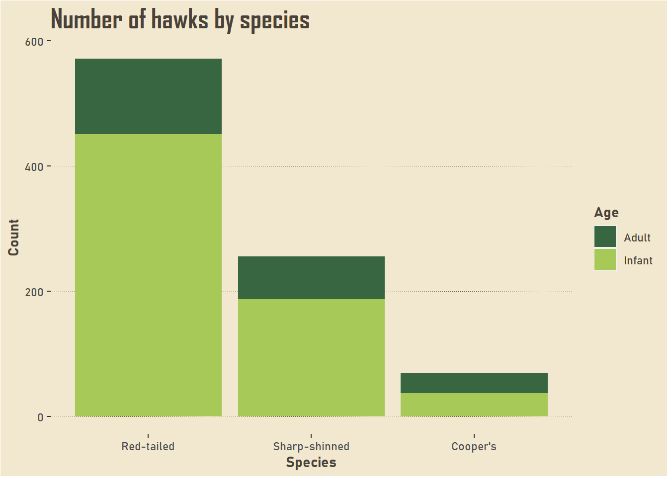
Here is the original plot for comparison.
ggplot(data = hawks, mapping = aes(x = Species, fill = Age)) +
  geom_bar()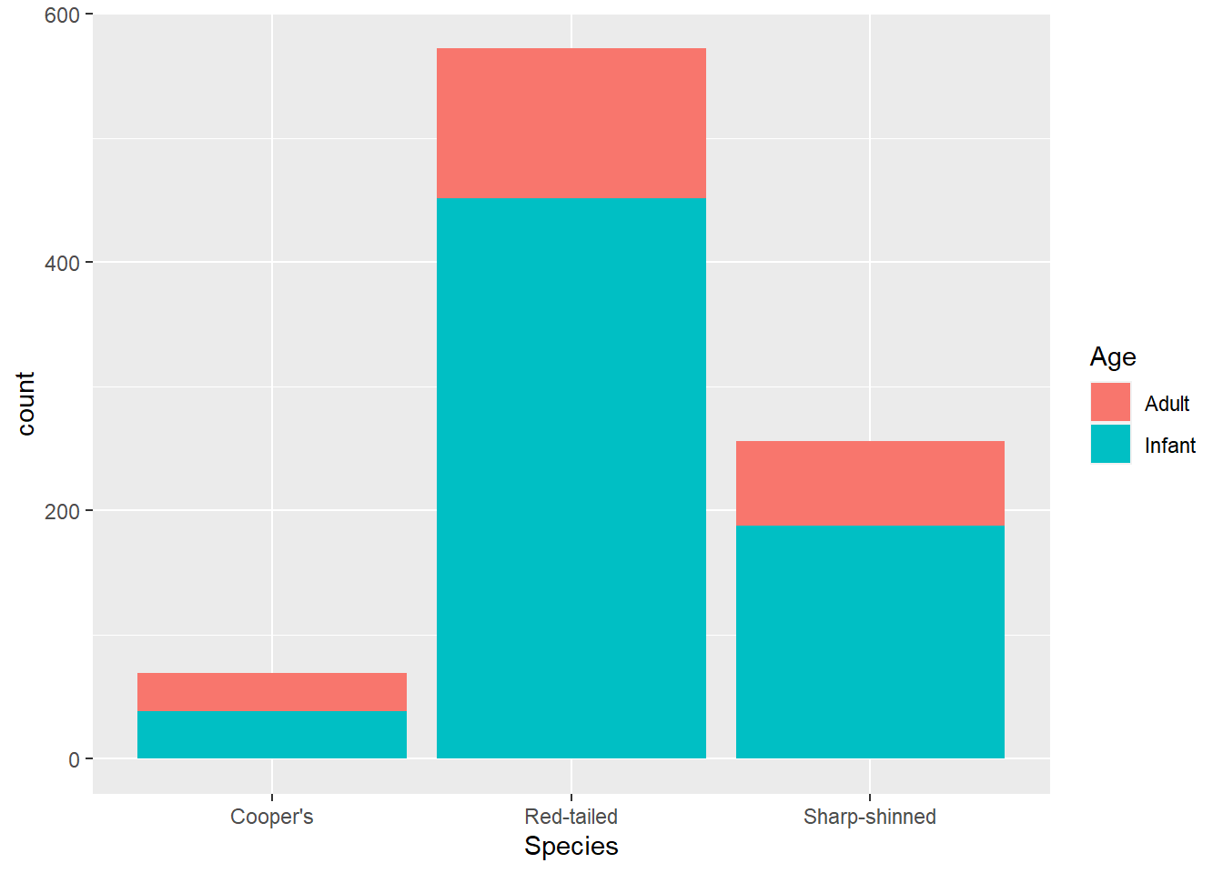
You can use your new theme on other plots.
ggplot(data = hawks, mapping = aes(x = Age, y = Weight, fill = Age)) +
  geom_boxplot() +
  hawk_theme_2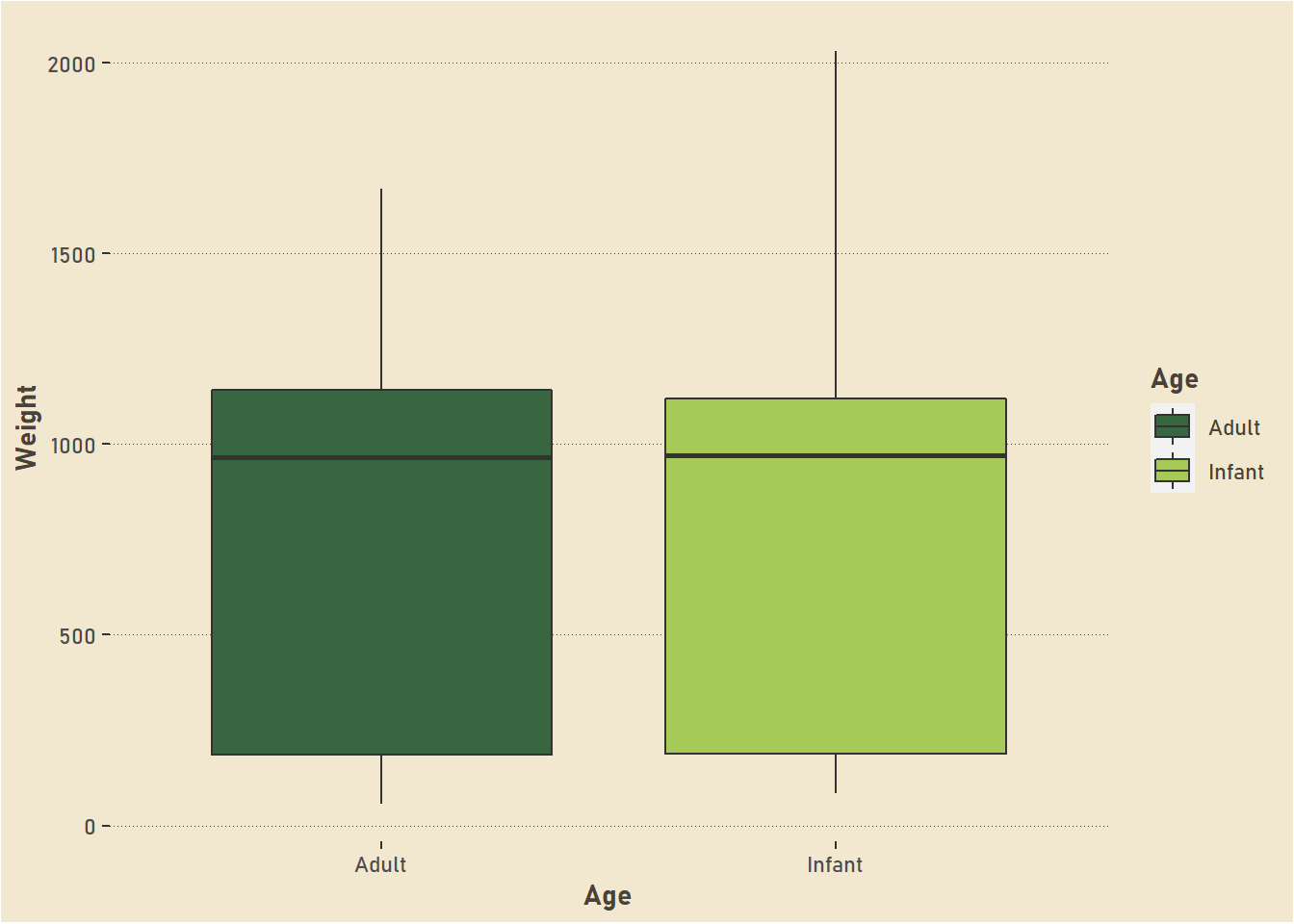
There are plenty of other things you can do within ggplot2 to make distinct, tailored graphs that look nothing like the original ggplot2 style, but I’m going to stop there so this doesn’t get too long. Keep exploring and you’ll find plenty to make sure you get exactly the look you are after!